Pier Luigi Nervi

Architectural Designs by Pier Luigi Nervi

Born in the Alpine town of Sondria in June of 1891, Pier Luigi Nervi was an Italian engineer and architect known for his innovative use of concrete and thin-shelled structures. In 1913, he earned his degree in engineering from Bologna’s Civil Engineering School, and upon graduation,Β joined the Society for Concrete Construction. Nervi considered building construction to be both an art and a science, and as such, dedicated his career to the innovative use of reinforced concrete.

During World War I, Nervi served from 1915 to 1918 as a lieutenant in the Italian Army’s Corps of Engineering. After the war, he worked, beginning in 1923, as a civil engineer in both Bologna and Florence. Nervi’s first significant work was the Augusteo Cinema Theater on the Vomero hill in Naples, whichΒ  was completed in 1927. This work was followed by Florence’s Stadio Artemio Franchi, originally named Studio Giovanni Berta. Built between 1930 and 1932, its boldly cantilevered roof and helical staircases won critical acclaim and popular attention throughout Italy.Β 

In 1932, Pier Luigi Nervi formed a contracting firm, called SocietΓ  Ingg. Nervi e Bartoli, with his cousin, engineer Giovanni Bartoli, with whom he would work for the remainder of his career. In 1935, Nervi won a competition held by the Italian Air Force for the construction of a series of hangers to be built throughout Italy. His conception of the hangers as concrete vaults with huge spans of reinforced concrete, constructed at low cost, were built between 1935 and 1941. After finishing the first hanger in Orvieto, he improved the design of the hangers in Obertello and Torre del Lago by using precast ribs, a lighter roof, and a modular construction method.

Nervi’s conceptual designs continued to grow through his search for new solutions to structural problems. Through his research, he developed a material of his own invention, a dense concrete called ferrocemento, which was heavily reinforced with evenly distributed steel mesh that gave both lightness and strength. This material played a vital role in Nervi’s design for the Palace of Labor, a collaborative project with his son Antonio Nervi for an exhibition space at the 1951 Turin Exhibition. A prefabricated structure in the form of a corrugated cylindrical arch, the Palace of Labor contained eighty-five thousand feet of exhibition space under a roof divided in sixteen structurally separated squares edged by continuous skylights. Sixty-five foot concrete columns were fixed in the center of each square and held these squares through small arched ribs. The use of arched ribs became a characteristic of Nervi’s oeuvre.

Pier Luigi Nervi’s solutions to construction problems was always direct; he transmitted the stresses developed within his structures to the ground by the shortest path. He used insights from his study of geometry to develop a new form of shell construction, one which generated three-dimensional lattices from concrete ribs. Nervi’s innovative use of pre-made concrete modules was cost-effective and resulted in both functional and ornamentally-geometric structures. Although his primary concern was never aesthetic, his works achieved a forceful expression to a great degree. Nervi introduced a creative three-dimensional quality into architectural design by his use of warping surfaces, folded plates, and intersecting planes. He emphasized functional needs, the technology of construction, knowledge of materials and statistics, and efficiency in building as the mainstays of an architect’s career.

Nervi was awarded Gold Medals by the United Kingdom’s Institution of Structural Engineers, the American Institute of Architects, and the Royal Institute of British Architects. in 1961 Harvard University appointed NerviΒ  to the Charles Eliot Norton Chair of Poetry. Towards the end of his career, Nervi, assisted by his two sons, the engineer Antonio and the architect Mario, confined his activities to design work in association with other architects. He died in January of 1979, at the age of eighty-seven, in Rome, Italy.

Nervi’s works include the UNESCO headquarters in Paris; Milan’s Pirelli Tower which was the first skyscraper in Italy; the Palazzetto dello Sport in Rome; the Sacro Cuore Bell Tower in Florence; the Cathedral of Saint Mary of the Assumption in San Francisco,;the cylindrical Australian Square tower, at the time the tallest concrete structure in the world; Vatican City’s Paul VI Audience Hall; and the Australian Embassy in Paris.Β 

Piero Fornasetti

The Artwork of Piero Fornasetti

Born in Milan, Italy in November of 1913, Piero Fornasetti was an eclectic artist who was an important figure in the Italian design scene. A prolific creator of designs, he was involved in many aesthetic disciplines including painting, drawing, graphic design, and product design. In the course of his career, Fornasetti created over ten thousand works and was responsible for one of the largest outputs of diverse objects and furniture of the twentieth-century.Β 

The first child of a wealthy family, Fornasetti was already at the age of ten drawing and displaying an innate inclination towards art. In 1932, he enrolled at the Academia di Brera, Milan’s public academy of fine arts; however, two years later he was expelled for insubordination. Although he applied to Milan’s Superior School of Arts Applied to Industry, Fornasetti was unable to adhere to the schools dogma due to his rebellious nature.Β 

Beginning in the early 1930s, Piero Fornasetti began a individual and comprehensive study ofΒ  engraving and printing techniques. With this knowledge and his developed technical skill, he began to print artist books and lithographs for many of the great artists of the time, including composer and playwright Alberto Savinio, painter Fabrizio Clerici, and painter and writer Giorgio de Chirico. The Fornasetti Art Printshop became the source of quality printing for many artists of his generation. Fornasetti, through his constant experimentation, later developed a printing method for graphic effects on silk; this innovation brought himΒ  to the attention of designer and publisher Gio Ponti, with whom Fornasetti would develop a close creative partnership.Β 

From the early 1940s and onward, Fornasetti produced a vast series of limited edition graphic works, which included calendars, holiday gifts, and images for advertising, theater, posters, and publications. He produced sketches and drawings for the Esino Lario School of Tapestry, whose fine silk tapestries were produced by local village girls. In 1940 Fornasetti began to publish his own work in the architectural design magazine Domus, and for two years designed a series of almanacs for Gio Ponti. Taking refuge in Switzerland in 1943 during the war, he continued his graphic work, expanding into watercolors, oil portraits, drawings in ink, and the creation of theatrical sets for Albert Camus’s 1938 β€œCaligula”.

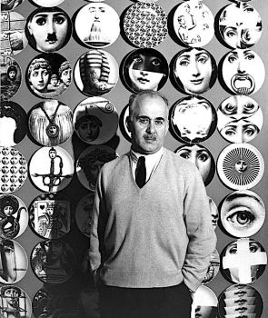
Upon his return to Milan, Piero Fornasetti and Gio Ponti began a close creative partnership which centered on architectural concepts in design and decoration. With the beginning of the 1950s, they put their theories into practice developing new simple and functional designs for the interiors of homes, apartments, cinemas and even ship cabins. Their initial project, the β€œArchitettura” trumeau, a furniture design concept seen in an image above, was exhibited at the 1951 Triennale IX in Milan. This piece of furniture became an icon of Italian design in the interwar years of economic growth.Β 

Fornasetti is best known for his designs using fanciful motifs such as the moon, sun, playing cards, animals, and other surrealist imagery; most of which were executed in black and white. In 1952, he began work on his iconic and best known series, β€œTema a Variazioni (Theme and Variations)”, a facial portrait of opera singer Lina Cavalieri, who was renowned at the time as a true archetype of a classical beauty. This image continues to appear today on a series of everyday objects from porcelain and fabrics to furniture and wall coverings. This portrait series entered into the world of theater as set designs inΒ  Fornasetti’s production of Mozart’s two-act opera, β€œDon Giovanni”. These designs were used in the December 2016 performances at Milan’s Teatro dell’ Arte and in theΒ  January 2017 performances at Florence’s Teatro della Pergola.

In 1970, Piero Fornasetti, along with a group of friends, operated the Galleria dei Bibliofili, where he exhibited his own work and the work of other contemporary artists. His paintings at this time contained both layered abstractions, with interacting colors done in various techniques, and figurative works done in a new pictorial style, where bodies and faces were composed of fruits and bottles. After the death of Gio Ponti in 1979 and the opening of London’s β€œThemes and Variations” design gallery in 1980, Fornasetti’s work and his idealogical concepts of form/function gained new interest both at home and abroad.Β 

Piero Fornasetti died in October of 1988 during a minor operation in hospital. In 2013, Silvana Annicchiarico, the director of the Triennale Design Museum, dedicated a first retrospective of Fornasetti’s work at the museum; this exhibition later went on tour to Paris’s MusΓ©e des Arts DΓ©coratifs and Seoul’s Dongdaemun Design Plaza. A 1987 collaboration between Fornasetti and fashion writer and publisher Patrick MauriΓ©s, which became a monograph entitled β€œFornasetti: Designer of Dreams”, was published posthumously in 2015 with an introduction by Italian architect and designer Ettore Sottsass. Piero Fornasetti’s work can be seen in the collections of New York’s Metropolitan Museum of Art and London’s Victoria and Albert Museum.Β 

Note” An example of the range of Piero Fornasetti’s oeuvre can be found at the online Fornasetti website located at: https://www.fornasetti.com/bd/en/

Frank Steeley


Frank Steeley, β€œLettering for Schools and Colleges”, 1902, G.W. Bacon and Company, Limited, London

Born in Birmingham in 1863, Frank Steeley was a draftsman and graphic designer. The son of a goldsmith who worked in the jewelry trade, he illustrated a set of thirty-six first grade drawing cards for the publisher G. W. Bacon and Company, Ltd, which was published circa 1893 as Bacon’s β€œExcelsior” Drawing Cards.

Steeley, in collaboration with Bernard H. Trotman, produced the 1901 design book β€œThe New Art Geometry: or, Geometrical Drawing Applied to Design”, which was also published by Bacon and Company. The exercises in this book, which used common tools such as t-squares and protractors, formed a graduated syllabus for upper level elementary classes and for classes in schools of art.

In 1902, Frank Steeley produced the book β€œLettering for Schools and Colleges”, a collection containing his designs for forty-two complete alphabets, with sets of numerals, initials, and monograms. Between 1903 and 1904, he published his two-volume series β€œNature Drawing and Design”. These books, examples of early Art Nouveau design work, described the process of using the natural forms of flowers and leaves to create patterns and simple line drawings. Both the book and the two-volume series were published by G.W. Bacon and Company.

Frank Steeley passed away in 1951 at the age of eighty-eight. Due to the historical and artistic significance of the work, Steeley’s books have been reprinted frequently and are still used as a basis for design study.

Susi Leeton

Susi Leeton, The Birch Tree House

Susi Leeton graduated with honors in a Bachelor of Architecture Degree from Melbourne University. After gaining international experience in Rome and Singapore, she returned to Melbourne and began working on a range of residential, retail and commercial projects. In 1997, Leeton established her office, Susi Leeton Architects and Interiors, where she has creatively explored both urban and rural settings.Β 

Susi Leeton Architects and Interiors is a small practice, located in the South Yarra area of Melbourne, Australia, which focuses on high-end residential projects. The practice encompasses all the disciplines of architecture and interior design: conceptual design, regulatory, town planning, engineering, documentation, and furnishing. Working with clients on a holistic level, the practice ensures design continuity within strict budget parameters throughout the project.Β 

The Birch Tree House is a sculptural, four bedroom, family home approached along a pathway aligned with a row of birch trees. The entry is sheltered within an arch containing an oversized door. The focus of the house is towards the northern wall of large steel sliding doors which open onto the yard with its large oval pool. The volumes of space are soft, sculptural forms that overlap and intersect creating workable family zones both inside and out.Β 

Natural light and soft materials, whose finishes were deliberately refined and tonal, were selected to create a chiaroscuro of light and shade. Texture was a main consideration in the design. Natural limestone, oak timber flooring, polished plaster walls, and linen curtains were the understated palette. The walls of polished concrete create a shimmering effect throughout every space.Β 

Birch Tree House was on the 2020 shortlist for the Australian Interior Design Awards. Construction was done by Visioneer Builders, an Australian award-winning construction group located in Richmond, Victoria Province, which isΒ  focused on unique, highly-specified single residences, multi=residential developments and commercial structures.Β 

The photography was done by Felix Mooneeram, a freelance photographer from the United Kingdom with a focus on design, architecture and lifestyles, and Nicole England, a Melbourne-based architecture and interiors photographer who has worked with many of the industry’s top architects and designers worldwide.Β 

Γ‰tienne-Louis BoullΓ©e

Architectural Design by Γ‰tienne-Louis BoullΓ©e

Born in Paris in February of 1728, Γ‰tienne-Louis BoullΓ©e was a architect, theorist, and teacher. Though regarded as one of the most visionary and influential architects in French neoclassicism, he saw none of his most extraordinary designs come to life.Β 

Throughout the late 1700s, BoullΓ©e taught, theorized, and practiced architecture in a characteristic style consisting of geometric forms on an enormous scale, an excision of unnecessary ornamentation, and the use ofΒ repetitive columns and other similar elements of regularity and symmetry. BoullΓ©e’s focus on polarity, offsetting opposite design elements, and his use of light and shadow were highly innovative for the period.

BoullΓ©e studied under architects Germain Boffrand of the AcadΓ©mie Royale d’Architecture, and Jacques-FranΓ§ois Blondel of the Ecole des Arts, where he studied until 1746. He was immediately appointed a professor of architecture at the newly established Ecole des Ponts et ChaussΓ©es, under its director, civil engineer Jean-Rodolphe Perronet, This professorship gave BoullΓ©e access to public commissions and an opportunity to engage his architectural vision within France’s social and economic progress.

Γ‰tienne-Louis BoullΓ©e was elected to the AcadΓ©mie Royale d’Architecture in 1762, and was appointed chief architect to Frederick II of Prussia. From 1762 to 1778, he designed a number of private houses, most of which no longer exist, and several grand Parisian hotels, which included the HΓ΄tel de Brunoy, demolished in 1939, and the still-existing HΓ΄tel Alexandre, on the Rue de la Ville-l’ÉvΓ¨que.Β 

BoullΓ¨e’s reputation and vision as an architect rests mainly on his teachings and his drawn designs which span the years from France’s Revolution in 1784 to Napoleon’s rise to power and Egyptian expedition in 1790. BoullΓ©e’s project drawings, as a collection, represented Β the necessary institutions for an ideal city or state. They displayed no direct political affiliations with any of the reigning doctrines or parties during this span of time; rather they adopted a belief in scientific progress symbolized in monumental forms, a dedication to celebrate the grandeur of a Nation, and, more often than not, a meditation on the sublime sobriety of death.

During this period, BoullΓ©e produced a continuous series of elaborate architectural designs beginning with a metropolitan cathedral and a colosseum for Paris, both designed in 1782. He designed a monumental-sized museum in 1783, which was followed by a cenotaph, or memorial tomb, for Isaac Newton in 1784. The design for a new reading room at the Royal Library was finished in 1785; and in 1787, BoullΓ©e finished plans for a new bridge over the Seine River.

In the late 1780s after the Revolution, severe illness forced BoullΓ©e to retire to his country house outside of Paris, where he finished the final architectural designs of his career. These included design plans for: a monument in celebration ofΒ the β€œFΓ©te Dieu”, one of the most popular of the Revolutionary festivals; a monument to β€˜Public Recognition’; and plans, finished in 1792, for both a national and a municipal palace. In silent protest against the terror spread byΒ  the Revolution, BoullΓ©e also designed a reconstruction of the Tower of Babel which took the from of a pure cone on a cubic base, with a trail of figures winding in a spiral, hand to hand to the top; this sturcture would by seen by the nation as a symbol of hope for a unified people with a common language.

Γ‰tienne-Louis BoullΓ©e died in Paris on February 4th of 1799, at the age of seventy. During his life, he taught some of the most prominent architects of his day including Jean Chalgrin the designer of Paris’s Arc de Tromphe, and Jean-Nicolas-Louis Durand, who anticipated the use of simple modular elements in construction,. BoullΓ©e’s book β€œArchitecture, Essai sur l’Art”, a collection of papers, notes and letters arguing for an emotionally committed Neoclassicism, was posthumously published in 1953.

β€˜Yes, I believe that our buildings, above all our public buildings, should be in some sense poems. The images they offer our senses should arouse in us sentiments corresponding to the purpose for which these buildings are intended.” — Γ‰tienne-LouisΒ  BoullΓ¨e

David Kindersley

The Lettering of David Kindersley

Born in Codicote in 1915, David Guy Barnabas Kindersley was a British typeface designer and stone letter-carver, the grandson of the Arts and Crafts potter Sir Edmund Elton. He was educated at St. Cyprian’s School, a preparatory school for boys in Eastbourne, and later, attended Marlborough College for three years, at which time he left due to rheumatoid arthritis.Β 

Kindersley traveled to Paris and enrolled at the Academie St. Julian where he studied French and sculpture; he continued his sculptural studies under the Induni brothers, Peter Guiseppe and Joseph Vincent, both of whom were marble carvers in London. In December of 1934, Kindersley became an apprentice to Arts and Crafts sculptor and typeface designer Eric Gill at his workshop in the market town of High Wycombe. While at the workshop, he worked on several important commissions, including St. John’s College in Oxford, London’s Dorset House, and Bentalls, a department store designed by architect Maurice Webb and located in Kingston upon Thames.Β 

David Kindersley left Gill’s workshop in 1936 and opened his own shop on the River Arun, where he continued commission work sent by Gill. On the death of Eric Gill in 1940, he settled Gill’s affairs and continued work at his own shop until 1945, at which time he relocated to the county of Cambridgeshire. Here Kindersley developed his own style and methods, his decorative carving embellishments, his use of heraldic ornamentation, and his taste for carving lettering on slate.

In addition to teaching calligraphy at the Cambridge Art School in the late 1940s, Kindersley received a major commission for carved relief imaps to be placed in the American War Cemetery. He also became a consultant for film titles, through the influence of his cousin Sir Arthur Elton, documentary filmmaker and head of film production at Shell Oil. A major commission under taken by KindersleyΒ 

In 1946, Kindersley established his first completely equipped letter-cutting workshop at Dales Barn in the village of Barton. He was joined by his wife and stone-cutter, Lida Lopes Cardozo, in 1976. A major commission undertaken by Kindersley and his wife was the distinctive large metal gates of the British Library which transformed its artistic β€œBritish Library” metal letters into a functional use. This project was followed by the gates at Queens’ College’s porter lodge; inspired by the same principle, the gates are composed of the letters β€œQueens College” wrought out of metal.Β 

David Kindersley is known for his accurate letter-spacing system. He designed the β€œMo T Serif” typeface in 1952, which was originally submitted for the British Ministry of Transport for road signs. Kindersley created the β€œItek Bookface” and, in collaboration with Will Carter, designed the book typeface β€œOctavian” for the Monotype Corporation in 1961. The Cardozo Kindersley Workshop publishes a number of typefaces based on Kindersley’s work, including the 2005 β€œKindersley Street”, also known as β€œKindersley Grand Arcade”, which is based on his 1952 β€œMo T Serif”.Β 

David Kindersley authored two major works on typeface, the 1976 β€œOptical Letter Spacing for New Printing Systems” and the β€œComputer-Aided Letter Design”. Very interested in Sufism, he also published a book β€œGraphic Sayings” which contains his typeface plates bearing sayings by the Sufi mystics taken from the writings of Sufi author Idries Shah.Β 

Note: Kindersley’s workshop, now known as The Cardozo Kindersley Workshop, relocated to Victoria Road, Cambridge, in 1977. Upon Kindersley’s death in 1995, Cardozo, along with Graham Beck and a crew of five, continued the design, carving, printing and gild work.

Second Insert Image: Granville Davies, “David Kindersley”, Gelatin Silver Print, Printed 2005

Bottom Insert Image: Rory Cooron, “David Guy Barnabas Kindersley”, 1989, Bromide Fiber Print, 45.5 x 27.8 cm, National Portrait Gallery, London

Illustrative Posters of Switzerland

Otto Baumberger, “PKZ (Coat)”, 1923, Lithograph, 90 x 128 cm, Private Collection

Situated in the middle of Europe with a culture having three national languages, Switzerland’s graphic arts, particularly in the illustrative poster field, was highly influenced by its neighbors. Two of its most celebrated Art Nouveau poster illustrators started their careers in the 1890s during the Belle Γ‰poque in France: EugΓ¨ne Samuel Grasset, teacher at the Γ‰cole d’Art Graphique and designer of the Grasset typeface, and ThΓ©ophile Alexandre Steinlen who became known for his bohemian cabaret posters and advertisements, with their black cat image, for the notorious Le Chat Noir Club.

The new century brought forward a first generation of sophisticated Swiss-born and based poster artists who, without exception, had studied abroad in Paris, Munich, and other European cities. Important figures of this generation whose later works would form a major portion of Swiss illustrative posters include: Emil Cardinaux, a painter, who devoted to the poster medium, produced luxury hotel and travel images with the qualities of Japanese woodcuts; Robert Mangold whose work was inspired by Greek mythology and classical allegorical figures; Otto Baumberger whose realistically rendered work formed a synthesis between typeface and image: and Niklaus Stoecklin who brought a clean, precisely detailed, and realistic style to commercial advertising. All of these artist later became leading members of the Early Modernist movement in Switzerland.

The Swiss Werkbund, an association of artists, architects, designers and industrialists, was established in 1913 and provided a major momentum to the development of the Swiss graphic and printing industry, including its design quality and product marketing. In the 1920s, the association promoted functional industrial design and, coordinated with the Zurich School of Arts and Crafts, made contributions to the development of modern Swiss graphic design.

Ernst Keller, one of the co-founders of the Swiss Werkbund, was a professor at the Zurich University of the Arts from 1918 to 1956. He initiated a graphic design and typography course which used simple geometric forms, vibrant colors, and evocative imagery to explain the meaning behind each typographic design. Many of his students gained international acclaim in the design field, including typeface designer Hans Eduard Meier, who designed the Syntax typeface, and the graphic designers Hermann Eidenbenz, who designed the Graphique and Clarendon typefaces, Lora Lamm, a major innovator of graphic fashion advertising. and Richard Paul Lohse, a pioneer in book design and one of the leading members of the Constructive Art movement.

Both Zurich and the city of Basel were the home bases for design schools, printers, and publishers in the 1930s. Switzerland became an important focus for graphic designers from many countries, due to imposed artistic restrictions and political pressures of the rising National Socialist Party. In the 1930s, a major breakthrough in posters occurred with the work of Swiss photographer Herbert Matter, who had studied and worked with French painters Fernand LΓ©ger and Adolphe Mouron Cassandre in Paris. He pioneered the use of photomontage combined with typeface in commercial art. Photomontage was an effect where multiple photo images would be edited into a seamless image for poster use. In 1932 Matter’sΒ  series of posters for Swiss resorts and the Swiss National Tourist Office achieved international acclaim.

The β€œPKZ (Coat)” , one of the most famous Swiss illustrative object posters, is a testament to the graphic skill of Otto Baumberger as well as to the lithographic and publishing skills of J. E. Wolfsenberger, Zurich’s renowned art graphics company. This advertising poster for the clothing line, Paul Kehl of Zurich, was the first object poster by Otto Baumberger in which he omitted all unnecessary text from its design. The advertiser is identified solely through the label on the coat. This poster was also an advertising first in the dramatic use of hyper-realism, as seen in the highly detailed rendering of the coat’s wool fibers.

Insert Top Image: Artist Unknown, “Lotschberg Tunnel, Loetschberg Railway”, 1912, Lithograph, Hubacher and Company Publisher, Bern, Private Collection

Insert Bottom Image:Β  Burkhard Mangold, “Fabbrica di Automobili”, 1907, Lithograph, 84 x114 cm, Β J. E. Wolfsenberger Publishers, Zurich, Private Collection

Bob Cantrell

Bob Cantrell, “Les Paul Special”, (Telecaster Model), 1961, Serial Number 37330, Metropolitan Museum of Art

Steve Miller received this guitar from Leslie West of the ‘Vagrants’ and ‘Mountain’ in 1967 or 1968. The original cherry red finish of the guitar had been stripped and repainted with the pale yellow that Gibson developed to appear white on black-and-white television. Miller had the guitar again repainted with intricate psychedelic designs by surfboard artist Bob Cantrell and changed the pickup covers, tuners, and controls to match the new color scheme. He used it extensively in recordings and live performances through the 1970s, including on Don Kirshner’s Rock Concert in 1973 and The Midnight Special in 1974.

Technical Description:

Mahogany body and neck, rosewood fingerboard; 24ΒΎ in. scale; intricate psychedelic painting on front and back of body; set neck with dot inlays and off-white binding; inlaid mother-of-pearl Gibson logo on headstock, truss rod cover with Les Paul signature; two P-90 soapbar pickups, three-way selector switch, two volume and two tone controls; nickel wrap-around tailpiece and Kluson tuners, clear and gold plastic knobs; original mahogany or cherry red finish stripped and repainted with custom psychedelic design, pickup covers, tuners, and knobs replaced to match finish.


Maskulo

Maskulo

Maskulo, founded in 2014, Β is an openly gay-owned and gay-oreinted festish gear company for men. They design, manufacture and ship their creations worldwide. Their gear, made of neoprene, lycra, latex and spandex, are available in Β a wide range of articles, including leggings, wrestling singlets, shorts, t-shirts, tank tops, jockstraps, boxer briefs, and other accessories.

Maskulo was founded by Artem Smyslov and Bulat Barantaev who both support democratic movements in Russia, with emphasis on support for gay movements. These incllude the Russian democratic “Solidarnost” movement, the civil movement “Za Prava Cheloveka” (Movement for Human Rights), and GORD ( Movement for Gays, Relatives, and Friends).

Reblogged with thanks toΒ http://fotofanisback.tumblr.com

Calendar

A Year: Day to Day Men: 19th of August, Solar Year 2018

The Musician

August 19, 1883 was the birthdate of French fashion designer Gabrielle Bonheur β€œCoco” Chanel.

Coco Chanel began designing hats initially as a diversion that evolved into a commercial enterprise. She became aΒ  licensed milliner in 1910 and opened a boutique at 21 Rue Cambon, Paris, named Chanel Modes. Chanel’s millinery career bloomed once theater actress Gabrielle Dorsiat wore Chanel’s hats in the 1912 play β€œBel Ami”.

In 1913, Coco Chanel opened a boutique in Deauville , financed by her long-time lover Arthur Capel, where she introduced deluxe casual clothes suitable for leisure and sport, constructed from humble fabrics such as jersey and tricot, at the time primarily used for men’s underwear. The location was a prime one, in the center of town on a fashionable street. Here Chanel sold hats, jackets, sweaters, and the mariniere, the sailor blouse. Her sister Adrienne and her aunt Antoinette were recruited to model Chanel’s designs; on a daily basis the two women paraded through the town and on its boardwalks, advertising the Chanel creations.

Chanel, determined to re-create the success she had enjoyed in Deauville, opened an establishment in Biarritz in 1915. Biarritz, situated on the CΓ΄te Basque, in proximity to wealthy Spanish clients, had neutral status during World War I, allowing it to become the playground for the moneyed and those exiled from their native countries by the hostilities. The Biarritz shop was installed not as a storefront, but in a villa opposite the casino. After one year of operation, the business proved to be so lucrative that in 1916 Chanel was able to reimburse Arthur Capel his original investment.

In 1918, Chanel purchased the entire building at 31 Rue Cambon, which was situated in one of the most fashionable districts of Paris. In 1921, she opened what may be considered an early incarnation of the fashion boutique, featuring clothing, hats, and accessories, later expanded to offer jewelry and fragrance. In addition to turning out her couture collections, Chanel threw her prodigious energies into designing dance costumes for the cutting-edge Ballets Russe. Between the years 1923–1937, she collaborated on productions choreographed by Diaghilev and dancer Vaslav Nijinsky, notably β€œLe Train Bleu” a dance-opera, β€œOrphee” and β€œOedipe Roi”

Coco Chanel’sΒ  design aesthetic redefined the fashionable woman for the post World War I era. Chanel’s initial triumph was the innovative use of the jersey fabric, a machine knit material manufactured for her by the firm Rodier. Prior to this, jersey tended to be used only in hosiery and for sportswear for tennis, golf and the beach. The Chanel trademark became the look of youthful ease, a liberated physicality, and unencumbered sportive confidence.

Renaissance

Renaissance

β€œTo a very strange lizard, found by the gardener of the Belvedere, he [Leonardo] fastened some wings with a mixture of quicksilver made from scales scraped from other lizards, which quivered as it moved by crawling about. After he had fashioned eyes, a horn, and a beard for it, he tamed the lizard and kept it in a box, and all the friends to whom he showed it fled in terror.”
-Girogio Vasari, The Life of Leonard da Vinci, The Lives of the Artists

Pontiac Chieftiain

Classic Hood Ornament of the 1952 Pontiac Chieftain

The Pontiac Chieftain is an automobile, manufactured from 1949 to 1958, porduced by Pontiac, a division of the General Motors Company. The 1949 Chieftain, along with the Streamliner models, were the first new car designs from Pontiac since World War II.

The Chieftain was introduced initially with four model designs; the Business Coupe, the Sedan, the Sedan Coupe and the Delux Convertible Coupe, each model having a choice of four engines. For the Β 1952 model year, the Chieftain was the only model car available when Pontiac discontinued the Streamliner line.

The hood ornament was made of amber plastic that lit up when the headlights were turned on.

Neuendorf House

Claudio Silverstrin and John Pawson, Neuendorf House, Courtyard Enclosure, Mallorca, Balearic Islands

The Neuendorf House in Mallorca was designed by John Pawson in partnership with Claudio Silvestrin. Entry to the house involves a theatrical descent between narrow walls past a basin set in a full-height groove. The approach presents, with its acoustics, a calibrated experience of enclosure and compression against the vast landscape that is the house’s context.

The courtyard’s composition si emphatically vertical. The exaggerated height of the walls is dramatised by the narrow slot whose edges emphasizes the wall’s thickness. A modest contrasting horizontal form is added by a bench set very low to the ground. The contrast between the landscape outside and the courtyard space is underlined by the view of the sky above and the landscape seen through the wall’s gap.