Ellsworth Kelly

Ellsworth Kelly, “Spectrum Colors Arranged by Chance VI”, 1951, Cut and Pasted Color Coated Paper and Pencil on Four Sheets of Black Paper, 94.6 x 94.6 cm, Museum of Modern Art, New York

Born in Newburgh, New York in May of 1929, Ellsworth Kelly was an American painter, printmaker and a sculptor who was associated with Color Field painting, Minimalism, and the hard-edge painting style. Introduced to ornithology, the study of birds, at an early age by his grandmother, he developed a passion for form and color which he carried into his future works. Encouraged by his early teachers to pursue an artistic career, Kelly studied, starting in 1941, at Brooklyn’s Pratt Institute, which he attended until his induction into the Army in 1943.

Entering into military service, Kelly requested to be assigned to the 603rd Engineers Camouflage Battalion which took many inducted artists. During World War II, he served with others in its deception unit, known as the Ghost Army, which used inflatable tanks and other elements of subterfuge, including the art of camouflage, to mislead the enemy forces. Kelly served with the unit until the end of the war’s European phase. From 1946 to 1947, he used the G.I. Bill to study at Boston’s School of the Museum of Fine Arts. 

During his time in Boston, Ellsworth Kelly exhibited in his first group show at the Boris Mirski Gallery and taught art classes at the Norfolk House Center in Roxbury. In 1948, he moved to Paris to study at its School of Fine Arts. Kelly immersed himself in Paris’s artistic resources and met such American artists as composer John Cage and dancer and choreographer Merce Cunningham, French surrealist artist Jean Arp and Romanian abstract sculptor Constantin Brâncuși , whose simplification of natural forms had a lasting influence on him.

In 1954 Kelly returned to the United States and settled in New York City. In May of 1956, and again in the fall of 1957, he had exhibitions at Betty Parson’s gallery. Three of Kelly’s works, “Atlantic”, “Bar” and “Painting in Three Panels”,  were selected for the Whitney Museum of American Arts’s exhibition entitled “Young America 1957”; all three works were considered radically different from the other entries in the show.

Ellsworth Kelly left New York City in 1970 and settled in Spencertown, a hamlet about one hundred-thirty miles north of the city. His husband, the photographer Jack Shear, joined him in 1984. Kelly worked in a twenty-thousand square foot extended studio in Spencertown until 2005. At that time, the couple moved to a small 1815 colonial house which they shared until Kelly’s death in December of 2015, at the age of ninety-two.

Ellsworth Kelly made his first abstract paintings in 1949. His 1950 “Seine”, consisting of black and white rectangles arranged by chance, was inspired by the dispersal of light on the surface of water. This was followed by a series of eight collages in 1951 entitled “Spectrum Colors Arranged by Chance I to VIII”, produced  by using number slips of different colors arranged on a large square grid. Kelly’s work gradually increased in size and became more abstract with a focus on shape and masses of color on the canvas plane.

Starting in the 1960s, Kelly started painting on angular and, later,  shaped canvases; the first shaped work was his 1966 “Yellow Piece”. His 1968 “Green White” marks the first appearance of the triangle in his work, a shape which reoccurs throughout his career.  In 1971, Kelly produced a series of fourteen paintings entitled “Chatham Series”, each painting consisting of two panels painted in balancing monochrome colors and joined together. In 1979, he used curves in two-color paintings made of separate panels. In his later works Kelly distilled his palette and worked on rectangular panels of many coats of white, on top of which is placed a shaped black canvas.

An artist of many mediums and styles, Ellsworth Kelly produced many drawings of plants from the late 1940s onward. In the 1960s, he took up printmaking and, from 1964 to 1966, produced his “Suite of Twenty-Seven Lithographs”, during his stay in Paris. His 1988 “Purple/Red/Gray/Orange” at eighteen feet in length may be the largest single-sheet lithograph ever made. From 1959 onwards, Kelly made freestanding folded sculptures; in 1973 for his large-scale outdoor sculptures, he switched mediums to steel, aluminum, or bronze. Kelly produced a total of one hundred and forty sculptures in his lifetime.

Top Insert Image: Onni Saari, “Ellsworth Kelly in his Broad Steet Studio, New York”, 1956, Gelatin Silver Print

Second Insert Image: Ellsworth Kelly, “Colors for a Large Wall”, 1951, Oil on Sixty Four Canvas Panels, 240 x 240 cm, Museum of Modern Art, New York

Third Insert Image: Ellsworth Kelly, “Spectrum IV”, Oil on Thirteen Canvas Panels, 297.2 x 297.2 cm, Museum of Modern Art, New York

Bottom Insert Image: Ellsworth Kelly, “Meschers”, 1951, Oil on Camvas, 149.9 x 149.9 cm, Museum of Modern Art, New York

Lynn Leland

Paintings by Lynn Leland

Born in Buffalo, New York in 1937, Lynn Leland studied at the Pratt Institute and Hunter College in New York, and continued his studies at the University of Delaware, where he achieved a Master’s Degree in Art History. After graduation, Leland worked as a dean of students at the New School in Manhattan. Awarded a Fulbright scholarship in 1961 to study in Europe, he attended the University of Fine Arts in Hamburg, where he studied under the Scottish sculptor Eduardo Paolozzi, widely considered as one of the pioneers of pop art.

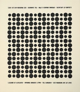
Active in the art scene of 1960s New York, Leland exhibited his work at the A. M. Sachs Gallery and at the Simon Preston Gallery on the Lower East Side. On the recommendation of Metropolitan Museum of Art curator and historian Henry Geldzahler, Leland’s work was included in the influential exhibition “The Responsive Eye” held at the Museum of Modern Art in 1965. This exhibition of one hundred twenty-five works, employing geometry and theories of perception and color, was organized by MoMA curator William Seitz and became one of the museum’s most popular shows at the time. 

Lynn Leland’s work was also included in many group exhibitions, including the Brooklyn Museum Biennial in 1960, the “Optics and Kinetics” exhibition at Ohio University in 1965, “Multiplicity” at Boston’s Institute of Contemporary Art in 1966, and the “Harry Abrams Collection” exhibition in 1966 at the Jewish Museum in New York’s Upper East Side.

Leland’s artwork included abstract color compositions, wood block prints, watercolor paintings, landscape paintings and photography. Based partially on his interest in contemporary musical composition, Leland’s abstract work throughout the 1960s remained focused on the optical effect of ordered grids of colored circles. Becoming disillusioned with the art market by the early 1970s, he stopped entering exhibitions and focused on a career in the art education field.. 

Lynn Leland had a full career as a public school art educator in the New York City public school system, teaching art to junior high school students from the 1970s to 1990s.  Upon his retirement, he moved to El Paso, Texas where he continued to pursue his interests in photography and painting, and  exhibited his work locally.  He was a member of the El Paso Art Association and the Photography Enthusiasts of El Paso. In order to be near his son Kipp Leland’s family, Lynn Leland moved to Helllertown, Pennsylvania, where he later passed away in 2019.

James Gleick: “The Wondrous Promise of the Earth”

Photographer Unknown, (The Wondrous Promise of the Earth)

“Somehow the wondrous promise of the earth is that there are beautiful things in it, things wondrous and alluring, and by virtue of your trade you want to understand them.” He put the cigarette down. Smoke rose from the ashtray, first in a thin column then (with a nod to universality) in broken tendrils that swirled up to the ceiling.”
James Gleick

William Gass: “The Word Itself Has Another Color”


Photographers Unknown, The Colors: Pink and Blue

“The word itself has another color. It’s not a word with any resonance, although the e was once pronounced. There is only the bump now between b and l, the relief at the end, the whew. It hasn’t the sly turn which crimson takes halfway through, yellow’s deceptive jelly, or the rolled-down sound in brown. It hasn’t violet’s rapid sexual shudder or like a rough road, the irregularity of ultramarine, the low puddle in mauve like a pancake covered in cream, the disapproving purse to pink, the assertive brevity of red, the whine of green.” 

—William Gass, On the Color Blue

William Gass, born in July of 1924 in North Dakota, was an American novelist, essayist, short-story writer, critic, and a philosophy professor, He taught for four years at the College of Wooster in Ohio, Perdue University for sixteen years, and Washington University in Saint Louis, where he was the David May Distinguished Professor in the Humanities from 1979 to 1999.

Gass wrote three novels, three collections of short stories, a collection of novellas, and seven volumes of essays. Three of these essay collections won Nation Book Critics Circle Award prizes and one collection the 2006  “A Temple of Texts” won the Truman Capote Award for Literary Criticism. His 1995 novel “The Tunnel”, a bleak novel about the human condition which took twenty-six years to write, received the American Book Award. His novel “Middle C”, published in 2013, won the 2015 William Dean Howells Medal awarded by the American Academy of Arts and Letters.

Gif images reblogged with thanks to a great visual site: https://thouartadeadthing.tumblr.com

Green Light

The Color Green

The color green is evoked by light which has a dominant wavelength of 495 to 570 nanometers, appearing in the visual spectrum between the colors blue and yellow. It is created in painting by the combinations of yellow and blue, or yellow and cyan. The shades of the color green range from yellow-greens, such as lime and avocado, to those with a blue tinge, such as emerald and turquoise. 

The English word ‘green’ comes from the Old English and Middle English word ‘grene, which like the German word ‘grün’, has the same root as the words ‘grass’ and ‘grow’, The first recorded use of the word as a term for a color in Old English is dated to about 700 AD. Although many languages, such as Germanic, Romance, Slavic and Greek, have old terms for “green’ which derived from words for vegetation, there is no identifiable single Proto-Indo-European source word for the word “green”. Linguistics studies indicate that all these terms were developed independently over time. 

In ancient Egypt, the color green was the symbol of rebirth and regeneration. Egyptian artists used the mineral malachite, finely ground, for painting on walls and on papyrus; this mineral was mined in the west Sinai and the eastern desert. Green had very positive associations for the Egyptians. A growing papyrus sprout represented the hieroglyph for the word green, linking the color to vegetation, vigor and growth. Osiris, the Egyptian God of the Underworld, was usually portrayed as having a green face, as seen in the tomb of Nefertari who reigned from 1295 to 1253 BC. Malachite amulets were worn for protection from evil and given to the dead to promote vigor in the deceased. 

The green pigment verdigris is made by placing a copper, brass or bronze plate, slightly warmed, into a vat of fermenting wine for several weeks. The green powder that forms on the metal is scraped off and dried. This pigment was used by the Romans in murals, and in Celtic manuscripts. It produced a blue-green color; but it was unstable and toxic. Verdigris was used in Persian and European paintings util the late 19th century, when it was replaced by the pigment chrome green. Vincent van Gogh used viridian, a more stable green patented in 1859, in a mixture of Prussian blue to create the green tinted sky in his 1888 painting “Cafe Terrace at Night”.

The use of the color green in painting plays an important role in the creation of naturalistic flesh tones, as seen in Duccio di Buoninsegna’s altarpiece “Maestà” at the Museo deli’Opera Metropolitana del Duomo in Siena, Italy. Its use in underpainting and glazing is seen in Jan van Eyck’s oil paintings and Paolo Uccello’s murals. Helen Frankenthaler used the color green almost exclusively in her 1992 “Overture”, one of her freest works, swirling green paint into vortices and and then dissolving it into rich patterns.  

Another example of the use of green was the installation work “Green Light Corridor” by Indiana-born artist Bruce Nauman which enforced the contrast between the perceptual and physical experience of space. He constructed two high walls spaced twelve inches apart, lit by green fluorescent bulbs hanging above the created corridor. Spectators walked through the tight space, the eyes adjusting to the green light. Upon exiting, their eyes adjusted again, causing them to see an optical illusion of the color pink, the opposite end of the color spectrum. 

Red Light


The Color Red

The narrow wavelength band of pure spectral light at 625 to 740 nanometers, stimulating the color photoreceptors of the eye’s retina, produces the color perception of red. At  the end of the visible spectrum of light, red ranges from the brilliant yellow-tinged scarlet to the bluish-red crimson, with variations in shade from pale pink to the dark burgundy. Made from the natural clay earth pigment of ochre, a mixture of ferric oxide and varied amounts of clay and sand, red  pigment was one of the first colors used in prehistoric art. 

Red, the color of blood touched by oxygen, has been associated in history with the ideas of sacrifice, courage and danger. In modern Europe and the United States, the sight of color red is associated with the ideas of heat, passion, activity, sexuality, anger, love and joy. While in many Asian countries, the color red is symbolic of the ideas of good fortune and happiness. Red placed prominently in the ceremonies of the Mayan and ancient Egyptian cultures, and later on in the Roman processions and military victory celebrations. It served as a color to show prominence and power, decorating the gates and walls of Chinese palaces and the costumes for the Renaissance nobility and wealthy. 

After the Western Roman Empire fell in the 5th century, red was adopted as a color of majesty and authority. It became an important part of Catholic Church rituals, symbolizing the blood of Christ and its martyrs, and used as the robe color of its Cardinals. Used to draw the attention of viewers, it was often used in Renaissance painting as the color of the costume of Christ, the Virgin Mary, or a central figure of a scene. Layers of pigment mixed with a semi-transparent glaze allowed more light to pass through, creating the effect of a more brilliant color. 

The earlier red, vermilion, was made from the powder mineral cinnabar and used widely in manuscript illumination of the Middle Ages and Renaissance paintings. Early in the 1500s, a new red appeared from Mexico, made from the tiny parasitic insect, the cochineal, which was more brilliant and worked well with textiles. With the arrival of cochineal red, painters had a rich crimson color, called carmine, that was used almost exclusively by all the great painters of the 15th and 16th centuries, including Vermeer, Rembrandt, Van Dyck and Tintoretto.

With the systematic study of color theory and the study of complementary colors in the 1800s, red was used to create specific emotions in the viewers of artworks. Vincent van Gogh avidly followed these studies. In his description of “The Night Cafe” to his brother Theo in 1888, Van Gogh wrote “I sought to express the red and green the terrible human passions. . . Everywhere it is a battle and antithesis of the most different reds and greens”. The Russian symbolist painter Kuzma Petrov-Vodkin used red in his 1912 painting “Bathing of a Red Horse” to shock viewers, provoking a furious discussion among Russian art critics. Mark Rothko used red in simple block forms on large canvases. In 1962 he painted a series of large murals of the Passion of Christ whose predominant colors were dark pink and crimson, chosen to inspire human emotions. 

Multi-Colored

Photographer Unknown, (A Multi-Colored Universe)

“Life is like a box of crayons. Most people are the 8 color boxes, but what you’re really looking for are the 64 color boxes with the sharpeners on the back. I fancy myself to be a 64 color box, though I’ve got a few missing. It’s okay though, because I’ve got some more vibrant colors like periwinkle at my disposal. I have a bit of a problem though in that I can only meet the 8 color boxes. Does anyone else have that problem? I mean there are so many different colors of life, of feeling, of articulation.” – John Mayer

The Blue Vision

Photographer Unknown, (The Blue Vision of the Mystic Madu, Scribe of the People, Servent of Min)

“Throughout the centuries there were men who took first steps down new roads armed with nothing but their own vision. Their goals differed, but they all had this in common: that the step was first, the road new, the vision unborrowed, and the response they received — hatred. The great creators — the thinkers, the artists, the scientists, the inventors — stood alone against the men of their time. Every great new thought was opposed.  . .But the men of unborrowed vision went ahead. They fought, they suffered and they paid. But they won.”
― Ayn Rand, The Fountainhead