
Photographer Unknown, Title Unknown, (The Pharaoh)
A fine art, film, history and literature site oriented to, but not exclusively for, the gay community. Please be aware that there is mature content on this blog. Information on images and links to sources will be provided if known. Enjoy your visit and please subscribe.
Photographer Unknown, Title Unknown, (The Pharaoh)


Addison 2 “Waterfall” Catalin Art Deco Radio, 1940, Dark Green and Butterscotch
The Addison 2 was made circa 1940 by Addison Industries Limited in Canada. It had an Art Deco unique styling and bold use of color; in this model it featured a marbleized dark green-black case and butterscotch trim. This streamlined radio design featured the famous “waterfall” speaker grill trim and surround “bumpers” at the base with speed-lines. A fairly small radio for the period, it measures 10.25 inches x 6 inches high x 5 inches deep.

A Year: Day to Day Men: 22nd of June
A Horticultural Marvel
June 22, 1920 was the birthdate of the American voice actor and comedian Paul Frees.
Paul Frees was born Solomon Hersh Frees in Chicago, Illinois. He had an unusually wide four-octave voice range. In the 1930s, he first appeared on vaudeville as an impressionist, under the name of Buddy Green. He began his career in radio in 1942; but it was cut short when he was drafted into World War II. Frees was wounded in action and returned to the United States for a year of recuperation.
Frees appeared frequently on Hollywood radio series, playing lead roles and alternating with William Conrad as the announcer on the 1940’s “Escape”. One of his starring roles on radio was as Jethro Dumont (the Green Lama) in the 1949 Series “The Green Lama”, a show about a caped crime fighter with mystical powers. Frees in that year voice all the parts in the “The Player” syndicated anthology series.
Frees was often called upon in the 1950s and 1960s to “re-loop” the dialogue of other actors, often to correct for foreign accents, lack of English proficiency, or poor line readings by non-professionals. These dubs extended from a few lines to entire roles. Frees read fo Toshiro Mifume’s performances as Admiral Yamamoto in the movie “Midway. He also provided much of Tony Curtis’ female character in the film “Some Like It Hot”. Frees also dubbed Humphrey Bogart in his final film “The Harder They Fall”. Bogart was suffering at the time from what would be diagnosed as esophageal cancer and thus could barely be heard in some takes, hence the need for Frees to dub in his voice.
Frees worked extensively with at least nine of the major animation production companies of the 20th century. He was a regular presence in the Jay Ward cartoons, providing the voices of Boris Badenov in “The Rocky and Bullwinkle Show”, Inspector Fenwick in “Dudley Do-Right”, commissioner Alistair and Weevil Plumtree in “George of the Jungle”, Fred in “Super Chicken”, and many others. Frees portrayed the radio-reporter in the 1953 film “War of the Worlds”, where he is seen dictating into a tape recorder as the military prepares the atomic bomb for use against the invading Martians. Memorably, his character says that the recording is being made “for future history… if any”
Although Frees was primarily known for his voice work (like Mel Blanc, he was known in the industry as “The Man of a Thousand Voices”), he was also a songwriter and screenwriter. His most notable screenwriting work was the little-seen 1960 film “The Beatniks”, a screed against the then-rising Beat counterculture in the vein of “Reefer Madness.
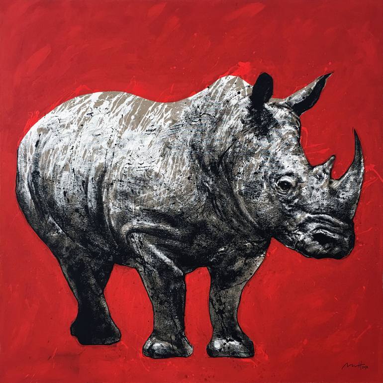
Mario Henrique, “Red Rhino”, 2018, Acrylic and Oil on Canvas, 149.9 x 149.9 cm, Private Collection
Mario Henrique is a painter based in Cascais, Portugal. He graduated with a degree in Communication Design from Lisbon’s University of Fine Arts in 2005 and earned his Masters Degree in 2007. Working as a creative director, he recruited and led teams working on various digital projects in Portugal, Spain and Brazil. As partner and head of design in one of these projects, he would eventually be part of a successful exit via acquisition, and then shifted his focus to contemporary painting, which had always been a parallel interest.
A prolific portraitist, Mario Henrique is fascinated by the unpredictability of the human behaviour: the brief glances, the impermanence of facial expressions, the sudden movements. Making use of uncommon and “rough” materials, like cardboards, reversed canvases and hardware tools, he paints abruptly and spontaneously. His approach relies on drippings, splashes and paint throws, so that the physicality of the painting process is transparent in the final piece.
Listed in various private collections across Europe, America and Asia, he has exhibited in galleries both locally and abroad, and was awarded an Honourable Mention for his participation in the Brasília Biennial of Contemporary Arts 2016. He is featured in Saatchi Art’s Inside The Studio and is currently represented by the prestigious Bill Lowe Gallery in Atlanta, Georgia. Mario owns a studio-gallery at the Marina, in Cascais, Portugal, where some of his paintings are publicly exhibited.

Paul Strand,, “Young Boy”, 1951, Gelatin Silver Print fromm the Series “Portfolio Three”, Detroit Institute of Arts
Paul Strand was born in New York in 1890. When he was 17 years old, he began taking photography courses, studying under famed photographer Lewis Hine. During his training, Strand also became acquainted with Alfred Stieglitz, whose 291 Gallery in New York provided inspiration for Strand and other aspiring modernist photographers and artists.
 A turning point in his career came in 1915 when Strand began to discover the intrinsic capabilities of the large-format camera, known as “straight photography.” His photographs moved from soft-focus scenes of modern New York that reflect the energy and movement of the city and its inhabitants to sharply focused expressions of objective reality. Strand’s images gain power from their integration of reality and abstraction within the composition.
n 1920 another shift occurred in Strand’s career. His social consciousness led him to explore the relationship between art and politics and to devote his career to progressive causes, turning to cinematography for a decade, from about 1920 to 1930.
In 1934 Strand helped found Frontier Films, a documentary film company dedicated to pro-labor causes. Strand remained an active photographer while working in film, but his subject matter changed. He concentrated on images of farmers and villagers in New England and Mexico, expressing nostalgia and admiration for a simpler life.
Insert Image: Paul Strand, Untitled, “Tir A’Mhurain, South Uist, Hebrides” Series, 1954, Gelatin Silver Print
Jamie xx, “Gosh” from the Album “In Colour”
James Thomas Smith, known professionally as Jamie xx, is and English musician, DJ, record producer and remixer. He is known for both his solo work and as a member of the English indie pop band “The xx”.
He has been described as a “driving force” behind the xx, contributing to the group’s significant commercial and critical success. As a solo artist, he has been recognised with a 2015 Mercury Prize nomination, and a 2016 Grammy Award for Best Dance/ Electronic Album nomination for his debut album “In Colour”.

A Year: Day to Day Men: 21st of June
Pastel Study in Blues and Pinks
The original Ferris wheel opened to the public on June 21, 1893 at the World’s Columbian Exposition.
George Washington Gate Ferris Jr. was a graduate of Rensselaer Polytechnic Institute and a Pittsburgh bridge-builder. He began his career in the railroad industry and then pursued an interest in bridge building. Ferris understood the growing need for structural steel and founded G.W.G. Ferris & Co. in Pittsburgh, a firm that tested and inspected metals for railroads and bridge builders.
The buttressed steel wheel that Ferris designed was truly original—so much so that the structure’s design had to be derived from basic assumptions because no one actually had experience constructing a machine of this size. By the winter of 1892, Ferris had the acquired the $600,000 in funding he needed but had just four months of the coldest winter in living memory to complete construction before the expo opened. To meet the deadline, Ferris split the wheel’s construction among several local machine shops and constructed individual component sets congruently and assembled everything on-site.
Construction crews first struggled with laying the wheel’s foundation. The site’s soil was frozen solid three feet deep overlaying another 20 feet of sand that exhibited liquefaction whenever crews attempted to drive piles. To counter the effects of the sand, engineers continually pumped steam into the ground to thaw it, then drove piles 32 feet deep into the bedrock to lay steel beams and poured eight concrete and masonry piers measuring 20 x 20 x 35 feet.
These pylons would support the twin 140-foot towers upon which the wheel’s central 45-ton, 45-foot-long, 33-inch-wide axle would rest. The wheel section measured 250 feet across, 825 feet around, and supported thirty-six enclosed wooden cars that each held up to sixty riders. Ten-inch steam pipes fed a pair of one thousand horsepower engines—a primary and a reserve—that powered the wheel’s movement. Three thousand of Edison’s new-fangled light bulbs lit up the wheel’s supports.
The Ferris Wheel opened on June 21, 1893 on the first day of the Exposition and ran until November 6th of that year. A fifty cent fare entitled the rider to an initial six-stop revolution as the passengers filled the cars and then a nine-minute continuous revolution with views across Lake Michigan and parts of four states. The attraction was a success, earning $726,805 during the Exposition. By 1906, after operating for thirteen years in three locations, the original Ferris Wheel had fallen into disrepair and was slated for demolition. It required three hundred pounds of dynamite to completely level the wheel and shatter its foundations.

Fritz Lang’s “Siegfried”, First Film of the “Die Nibelungen” Series,1924

A Certain Magnitude
“Again, a beautiful object, whether it be a living organism or any whole composed of parts, must not only have an orderly arrangement of parts, but must also be of a certain magnitude; for beauty depends on magnitude and order. Hence a very small animal organism cannot be beautiful; for the view of it is confused, the object being seen in an almost imperceptible moment of time.
Nor, again, can one of vast size be beautiful; for as the eye cannot take it all in at once, the unity and sense of the whole is lost for the spectator; as for instance if there were one a thousand miles long. As, therefore, in the case of animate bodies and organisms a certain magnitude is necessary, and a magnitude which may be easily embraced in one view; so in the plot, a certain length is necessary, and a length which can be easily embraced by the memory.
The limit of length in relation to dramatic competition and sensuous presentment, is no part of artistic theory. But the limit as fixed by the nature of the drama itself is this: the greater the length, the more beautiful will the piece be by reason of its size, provided that the whole be perspicuous. And to define the matter roughly, we may say that the proper magnitude is comprised within such limits, that the sequence of events, according to the law of probability or necessity, will admit of a change from bad fortune to good, or from good fortune to bad.”
― Aristotle, Poetics


Parva Scaena (Brief Scenes): Set Three
“I’m going to smile, and my smile will sink down into your pupils, and heaven knows what it will become.”
― Jean-Paul Satre, No Exit

“To ensnare an elusive answer, camouflage the question.”
―Khang Kijarro Nguyen

Photographer Unknown, (The Ascension of Man)

Artist Unknown, (Lips), Computer Graphics, Gay Film Gifs
Reblogged with thanks to http://3leapfrogs.com

Movie Poster for “Parola di Dio”
“Parola di Dio” is a 2016 film by Russian director Kirill Serebrennikov. The story revolves around Veniamin, a high school student, in the middle of an adolescent crisis. His troubles are appeased by the manic and compulsive reading of the bible which he is convinced will put his confusion in perspective.
“Parola di Dio” was presented at the 69th Cannes Film Festival in the Un Certain Regard section, winning the Francois Chalais prize. The film is distributed by Wonder Pictures and was released in Italy on October 27, 2016.

Ise Ananphada, Illustration Poster for “The Fall”
Freelance illustrator Ise Ratta Ananphada (Ratinan Thaicharoen) was born in Bangkok,Thailand, where she currently lives and works. She attended Rangsit University in Thailand and received a BFA in Visual Communication Design as the first class honor in 2007.
Ise Ananphada’s style is influenced by traditional Thai art that consists of multiple layers of symbolism that could be described as visions, illusions, madness, genius and poetry. Her aerial, delicate rendering style and use of pastel colors compliment the intricate details of her paintings, many of which have movie themes.
More of her work can be seen at https://www.madduckposters.com